|
| ||||||||||||||||||||||||||||||||||||||||||||||
|
Section: Science Life |
deutsche Version  Print-Version |
|
Global Index for climate change Extreme today, almost normal tomorrow | |
|
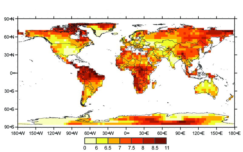
One number is enough: ETH climate researchers have used a newly developed Index to identify the regions of the world that will feel the greatest effects of climate change in the future. Peter Rüegg South and Central America, Southwest Africa and even the region around the North Pole will be the areas most affected by the climate change now taking place. The USA, southern Greenland, Central and Eastern Europe, Central Asia and large parts of India or Australia will not escape altogether unscathed. The effects of climate change in these regions will just be comparatively mild. This is the outcome of a new Index that ETH researchers including Michèle Bättig (1) from the Institute of Biogeochemistry and Pollutant Dynamics, the first author of the study, have developed to provide a yardstick for the magnitude of global climate chang Too wet, too dry, too hot yields the Index The Index is composed of nine different indicators. These include extremely hot, dry and wet years together with extreme temperature and precipitation events in the three summer and winter months. To do the calculation, the researchers divided the world into grid squares each measuring 375 x 375 kilometres.
|
The hottest, driest and wettest years in summer and winter within 20 years were calculated for each square for a reference period from 1961 to 1990. Next the ETH Zurich researchers calculated how often these extreme events will occur in the years 2071 to 2100. The aggregate of these nine indicators yields the Climate Change Index. The climate changes forecast in various regions can be compared with one another by using the map. No region is spared Thus the regions most affected have index values greater than 8.5, while those for the less affected regions are do not exceed 6.5. Bättig and her colleagues have also prepared an individual world map for each of the nine indicators. These maps show how often particular events will occur within the 20 years between 2071 and 2100. The maps are based on twenty-year extreme events occurring between 1961 and 1990. Due to the number of hot years possible at by the end of the 21st century, the map of the earth is entirely coloured brown. This means that 17.5 to 19 years in every two decades in the future will be as hot as the hottest year in two decades today, and this will happen worldwide. Temperatures that were still regarded as extreme between 1961 and 1990 will be normal then. The distribution of precipitation behaves differently. Extremely dry years will be the norm in South and Central America, West and North Africa and in Southwest Europe, i.e. 13 out of every 20 years will be as dry as the extreme during the reference period. On the other hand, in the far north an equal number of years will be much wetter than hitherto. The discussion about the Earth’s climatic changes led scientists from the Institute of Biogeochemistry and Pollutant Dynamics together with the Institute for Atmospheric and Climate Science of ETH Zurich to create this Index, which is based on extreme climatic values and permits a direct comparison of the expected climate changes of individual regions. To enable the quickest possible overview of the findings, the scientists presented their research results on a map of the world. This should also allow politicians to grasp the far-reaching consequences of climate change at a glance without being encumbered with detail. |
||||||
|
Footnotes:
You can write a feedback to this article or read the existing comments. | |||||||